Honey Bee Mine in Spark Speckle, Slate Kettle, and Compass Kettle
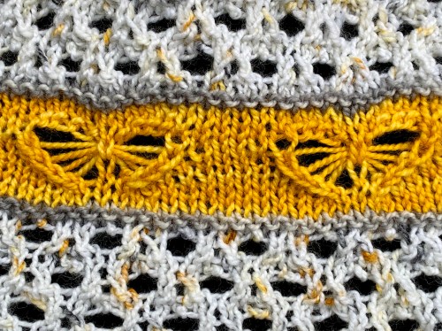
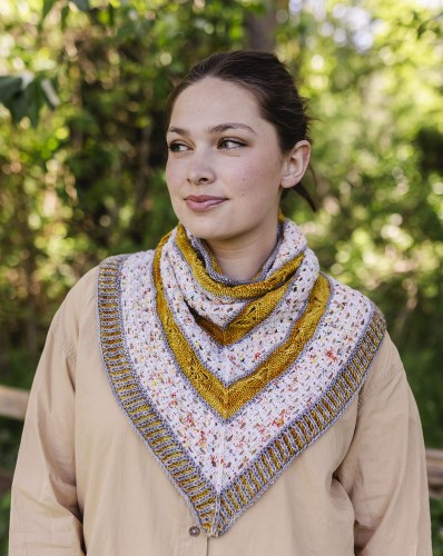
Honey Bee Mine is a cozy three-color bandana cowl that features sweet honey bees flitting among the honeycombs. The cowl looks like a triangular shawl when worn, but it needs no fussing or pinning to remain stylishly in place.
Honey Bee Mine is worked in the round from the bottom up, so the bees are flying upwards. Multiple yarnovers over several rounds are dropped and scooped up to form the wings of the honey bees, and double yarnovers create bold eyelets for the honeycomb. The pattern uses 3 colors of fingering weight yarn. The edging can be knit in either Brioche Rib or 1×1 Ribbing. (I’m always sneaking in brioche!)
Honey Bee Mine in Panettone Speckle, Slate Kettle, and Gold Hill Tonal
I designed this for Knit Picks in 2022/2023 using Hawthorne Fingering. I love this workhorse of a yarn! The Honey Bee Mine pattern rights have returned to me, so I am now able to offer this through Ravelry and Payhip. Use coupon code SWEET for 15% off through June 26, 2025.
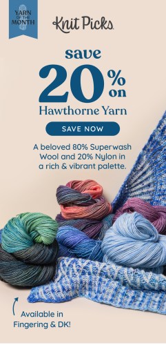
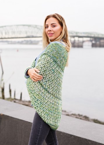
I was tickled to see my Both Sides Now Shawl peeking out under a pile of yarn in an email from Knit Picks.
A green version of Both Sides Now is on the website.
I received another email this morning. It’s like seeing your kids out in the world. Sweet!
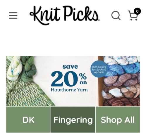
I’m not sure how long the sale lasts, but if you want to buy some Hawthorne, here’s the link.
Here’s Both Sides Now, available for purchase on the Knit Picks website. It was on the cover of their brioche book several years ago. So pleased to see it again!
Honey Bee Mine in Spark Speckle, Slate Kettle, and Compass Kettle
Honey Bee Mine is a cozy three-color bandana cowl that features sweet honey bees flitting among the honeycombs. The cowl looks like a triangular shawl when worn, but it needs no fussing or pinning to remain stylishly in place.
Honey Bee Mine is worked in the round from the bottom up, so the bees are flying upwards. Multiple yarnovers over several rounds are dropped and scooped up to form the wings of the honey bees, and double yarnovers create bold eyelets for the honeycomb. The pattern uses 3 colors of fingering weight yarn. The edging can be knit in either Brioche Rib or 1×1 Ribbing. (I’m always sneaking in brioche!)
Honey Bee Mine in Panettone Speckle, Slate Kettle, and Gold Hill Tonal
I guess I’m not done with assigned pooling yet! I had this monster skein of Blue Moon Fiber Arts Plushy left from teaching a previous planned pooling class. I was stack pooling it, but I put it aside when class was over.
For planned pooling to stack, I need to keep my eye on my knitting, adjusting my tension as needed to make the colors stack or move slightly to the left or right. But I don’t usually look at my knitting; I’m usually reading blogs or my Kindle. So planned pooling means I have to be more mindful. Right now I want to be more mindless!
This is why I’m really enjoying the assigned pooling. It just takes an occasional glance to see when it’s time to work the pooling stitches. That’s much more relaxing for me because I don’t have to control the tension. So I’m knitting a cowl, approximately 34 inches in circumference (making a wild guess based on the piece that was previously on the US 10 needles). I’m using the sunburst stitch whenever the deep red-purple appears.
Plushy is an Aran weight yarn (Ravelry says worsted and I disagree), 3.5 to 4 sts per inch, 330 yards/270g. I think this color is Let Your Love Light Shine. It’s spectacularly cheery!
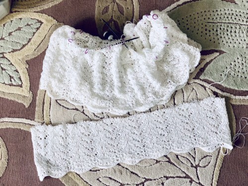
Still occasionally knitting the white linen too, while my mind chews on how I want to arrange these three skeins of Knit Picks Hawthorne Fingering. I have an idea…but it’s going to take a lot of mental gymnastics before I get there.
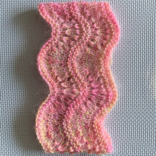
The little 50g balls go pretty quickly. The knitting looks loose and crinkly, but I have this previously blocked swatch to remind me of how swingy, smooth, and drapey it’s going to be.
Do I have it in me to carry on? MAYBE! This is my ”for fun” knitting, which has nothing to do with work or publishing a pattern. That means there’s no deadline, and no reason to finish it…unless I really want to. We’ll see if I get distracted! I do have a design to work on, with this yarn…
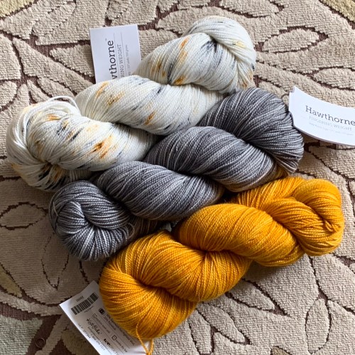
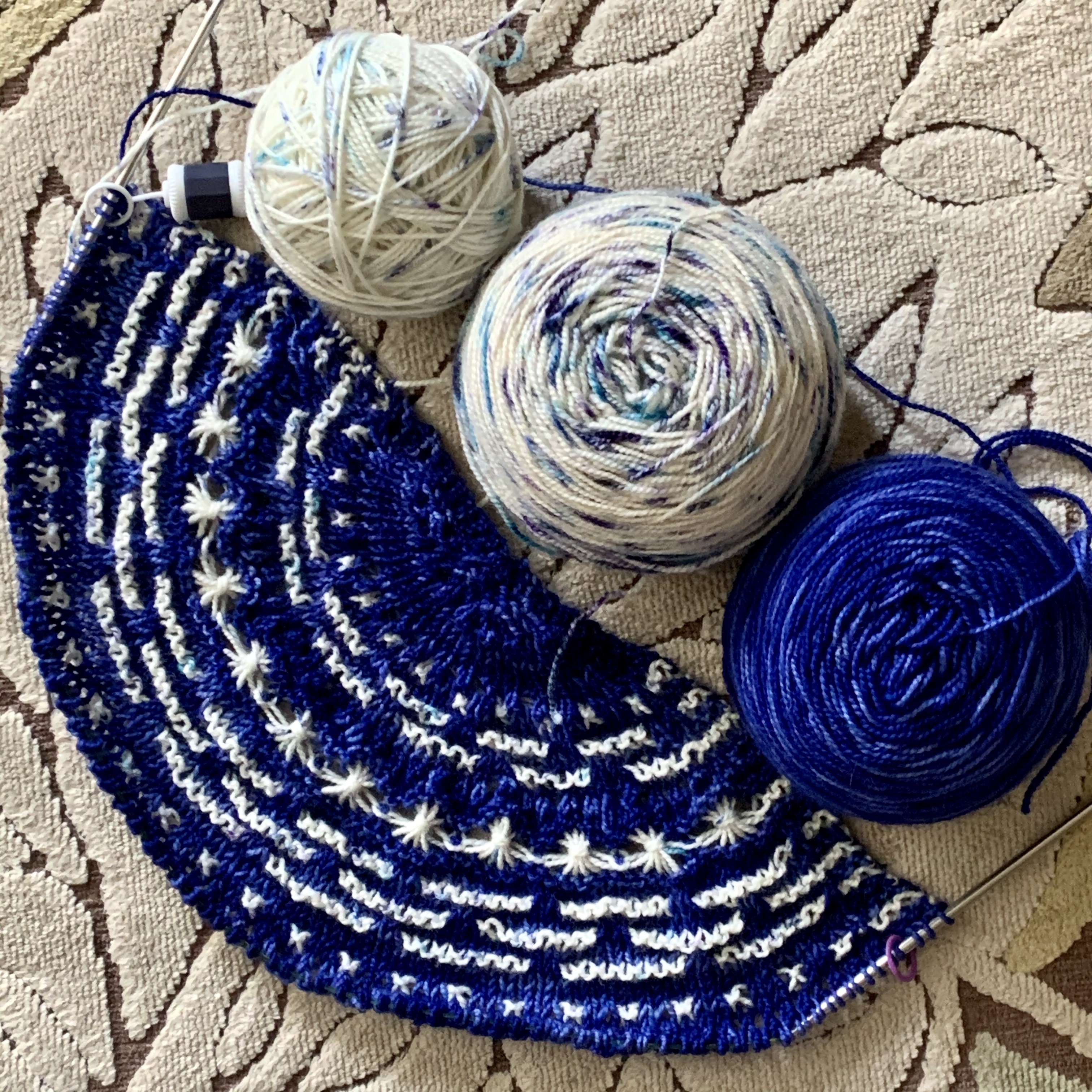
Knit Picks Hawthorne in Spark Speckle, and Slate and Compass Kettle DyeiPhone
Do you know the trick for checking your tonal contrast? Put your camera phone into monochrome, and that will give you a good idea if your yarns are contrasty enough. On an iPhone, use the carat at the top to change the menu at the bottom. The 3 overlapping circles (middle picture) indicate color choices. Swipe right until you get to MONO (that’s what it says in the 3rd picture; sorry it’s fuzzy). You can also do this after taking a picture too, using the edit feature when looking at your pictures. You’ll get something that looks like this.
Here I have a light and two mid-range. The gray surprised me; I thought the gold would be darker of the two mid-tones. I think I’ll aim to use each of the kettle dyes with the speckle, but not necessarily with each other. I don’t really know yet, though. Swatching is in order! I think it’s either a shawl or a shawlish cowl like Cosette, and I’d like it to have a bee theme, because of the honey colors.
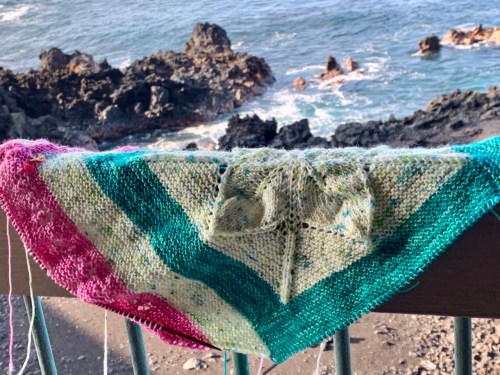
Remember this color combo? I really wanted it to work for a version of my Cherry Blossom Wrapture for the Knit Picks IDP (Independent Design Partnership) program. I took it to Hawaii to knit after the Dotty Bed Socks (working, working, working). I liked the green and the pink together. I liked the green and the speckle together. I didn’t like the pink and the speckle together. Blergh. I tried to make it work by making the log cabin frame around the leafy center green instead of pink, hoping that using less pink would make it work.
I kept telling myself it was okay, but the pink still looks like a tacked on afterthought. The shawl was reading as way more green than pink, and it’s the pink that I’m most interested in. Over the course of vacation, I got word that this pattern will be featured by Knit Picks in spring 2022 for the IDP program, and the thought of it not being perfect made my stomach hurt. So I started poking at using a different color with the Poseidon and Italian Ice.
Camellia, Goddess, Turkish Delight
My options? Turkish Delight (a deeper and more magenta pink), or Goddess (straight up purple). I love the Goddess with the greens, but I don’t think the flowers would show up in a color that dark, so I decided to try the Turkish Delight.
I think Turkish Delight is a winner! Somehow it holds its own against the green and yellow, where the Camellia did not. So that’s how it’s going to be. I love it. Now I just have to finish knitting it, and re-writing parts of the pattern. I’ve done the math and know how big it’s going to be…yay math!
Bisquee is helping. She let me her pawdicure snips, because I left the snips from this project bag in my studio for a class.
What are you working on during this in-between week? Are you planning to celebrate the new year with a new cast on? I want to finish this project first, and I have miles of garter stitch to go…
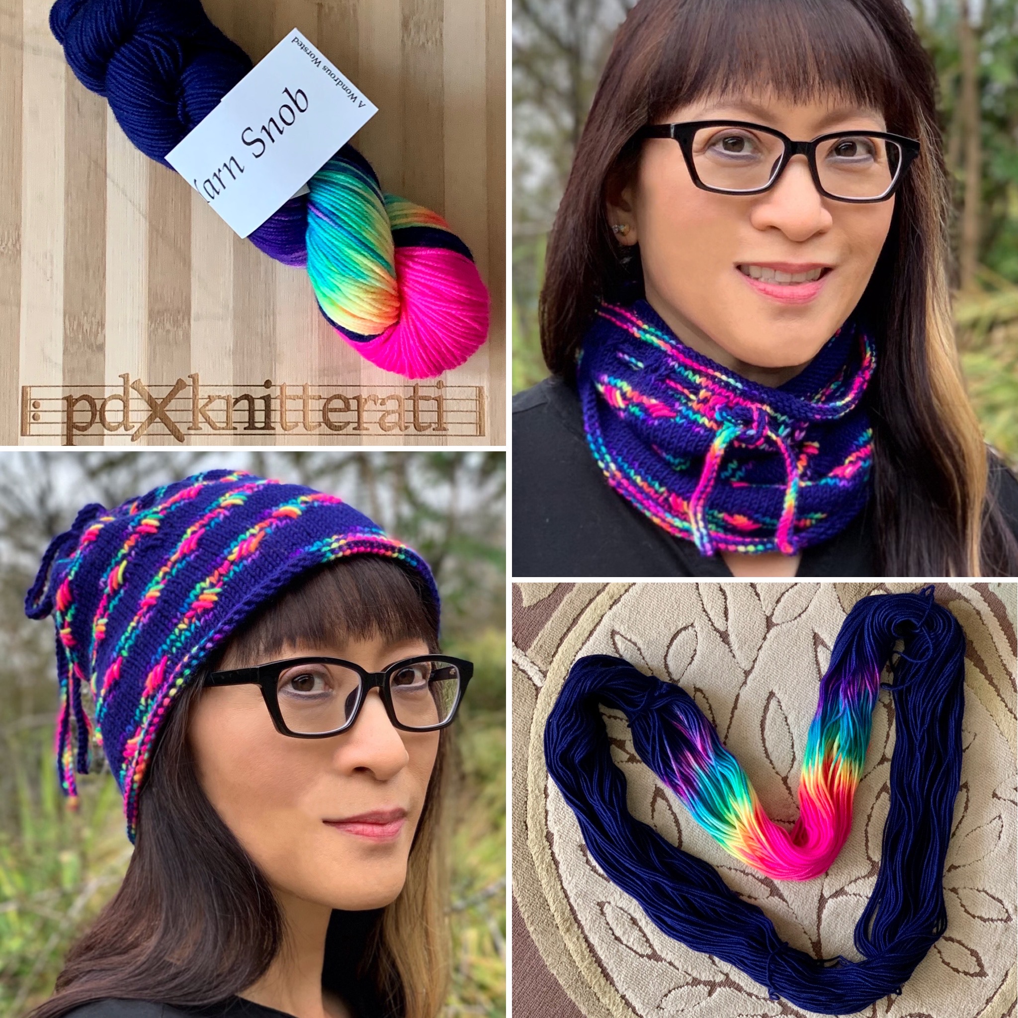
I recently designed the Swizzle Cowl for Knit Picks, for their Twelve Weeks of Gifting. It’s available today!
Knit with Muse Fingering and Aloft Kid Mohair held together on US10/6mm needles, it’s a quick knit for you or a loved one. The Swizzle Cowl pattern has instructions for 3 sizes, so whether you like your cowls close to the neck, long and double looped, or somewhere in between, I’ve got you covered.
Here’s a closer view of the stitch pattern from my submission swatch. Apparently I never took a picture of the finished cowl! It’s in a box here, somewhere…
One other Knit Picks item going on…I’m knitting a version of my Cherry Blossom Wrapture shawl with Knit Picks Hawthorne, so I can offer the pattern through their IDP (Independent Designer Partnership) program.
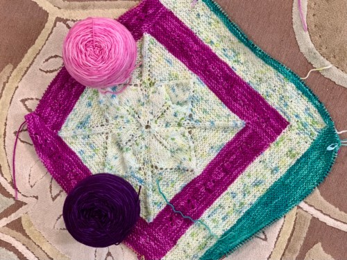
Knit Picks Hawthorne in Camellia, Poseidon, and Italian Ice Speckle
The Poseidon and Camellia have a blue undertone, but the speckle has more of a yellow undertone that I expected. (The joy of choosing color online!) Poseidon plays well with both of the other colors, but I wasn’t sure about the Camellia with the speckle. So I’m making the log cabin frame around the speckled center in Poseidon instead of Camellia. The pink will be a pop, and begin further away from the big speckled center. I think it will work. We’ll find out soon…
Original colorway
This just means rearranging my blocks/logs. If I don’t like it when I get there, I’ll get some Bare (natural) and swap that in. Hope I don’t have to!
I’m nearing the end of my log cabin wrap (pattern soon), and that means I’m daydreaming of what’s next on the needles. I’m tempted by cute little sweaters that I see in my Instagram feed, so I’ll probably cast on for one, to increase my teaching wardrobe. You know we have to look good from the waist up on Zoom! I want to knit from my accidental stash (yarn that didn’t work out for something else, usually). Here are two contenders.
photo by Kay Hopkins
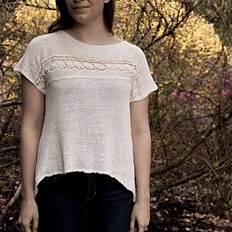
This is the Leaves Shell by Kay Hopkins, Knit for the Soul (Ravelry link). It’s a linen knit, and it will be swingy and drapey. It’s knit top down, and it has a leaf motif going down each side “seam” which is very pretty. I have a good amount of Quince fingering weight linen, back when I was deciding between fingering and Aran for what eventually became my Kittiwake (Ravelry link), Aran weight.
Kittiwake, by mephoto by Casapinka
This is The Birdwatcher by Casapinka (Ravelry link). It’s knit from the bottom up. I have to go poking into my fingering weight stash; I’m not sure I have two skeins of any color! Well, I do have this…
I don’t think I’m ever going to finish my Rio Calina; the moment has passed. I was using 2 skeins of fingering to approximate a worsted weight yarn. I’ll probably frog it no matter what. The yardage is a little short for The Birdwatcher (two 357 yard skeins instead of two 400 yard skeins). On the other hand, I’m a little short, too, and would knit this to 9” to the underarm, instead of the 12” called for. Is that enough to offset the difference? I’d hate to run out of yarn before finishing the neck.
Of course, I could get creative and begin with a provisional cast on at the underarm, work the top, and then pick up and work downwards and knit until I’m out of yarn. Oh, but wait. The lace, how would I know when to begin the lace?
I could begin with that provisional cast on, work the top, and then work from the bottom up until I’m almost out of yarn. And then KITCHENER STITCH/GRAFT the two parts together. Would that be just too much excitement?
Actually, a better plan would be to begin with the provisional cast on, work the top. Then work the lace. Then work stockinette down from the provisional cast on until almost out of yarn. And finally graft the two parts together, so if my grafting isn’t perfect, it will be at a natural transition point to the lace, and it won’t be as obvious.
Or, I could just use a different yarn. Maybe even the linen. But that has a much different look and feel.
This is what runs through my head while I’m working on something else…
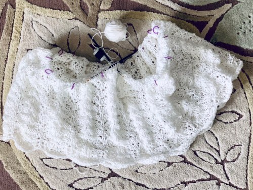
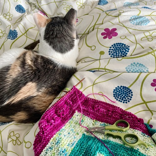
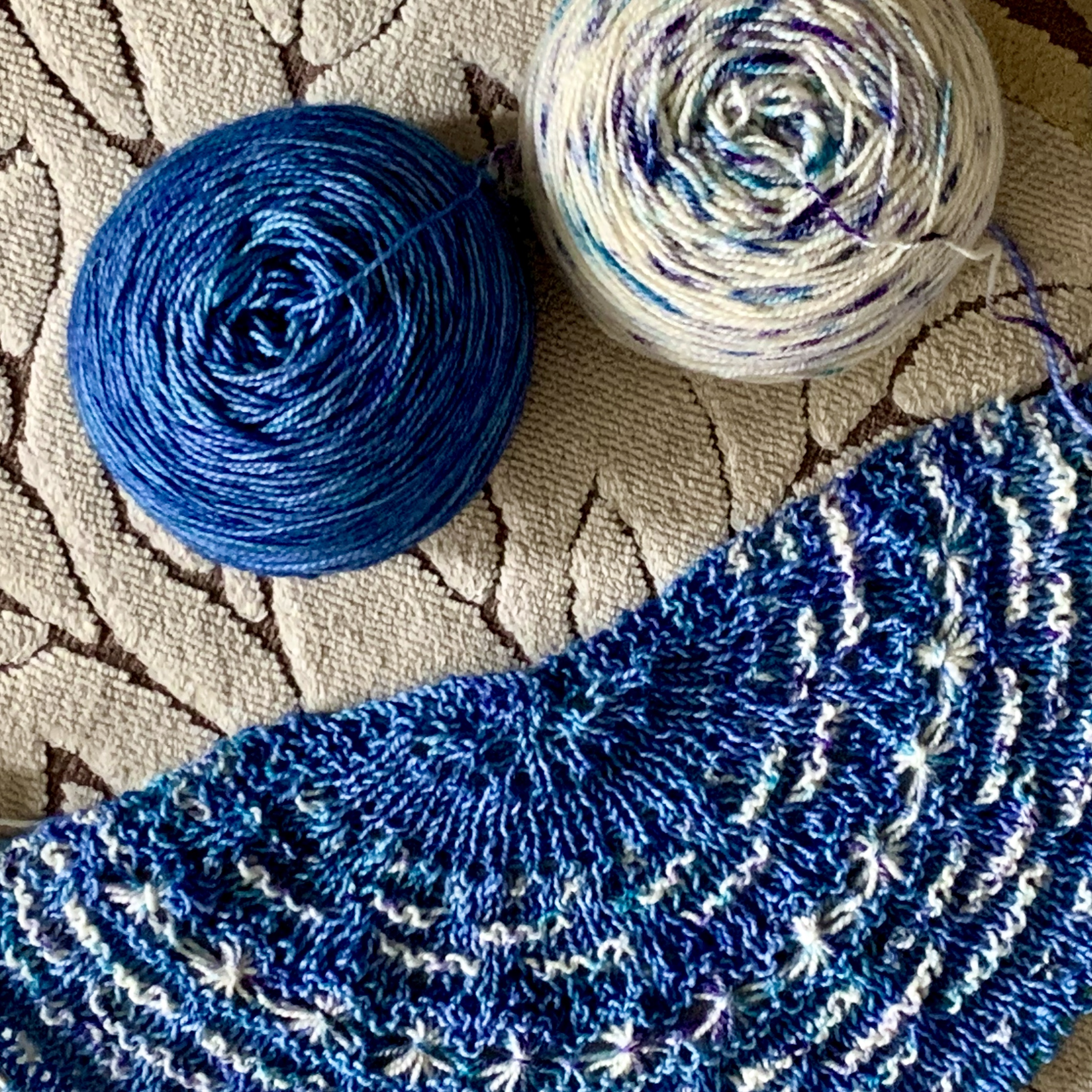
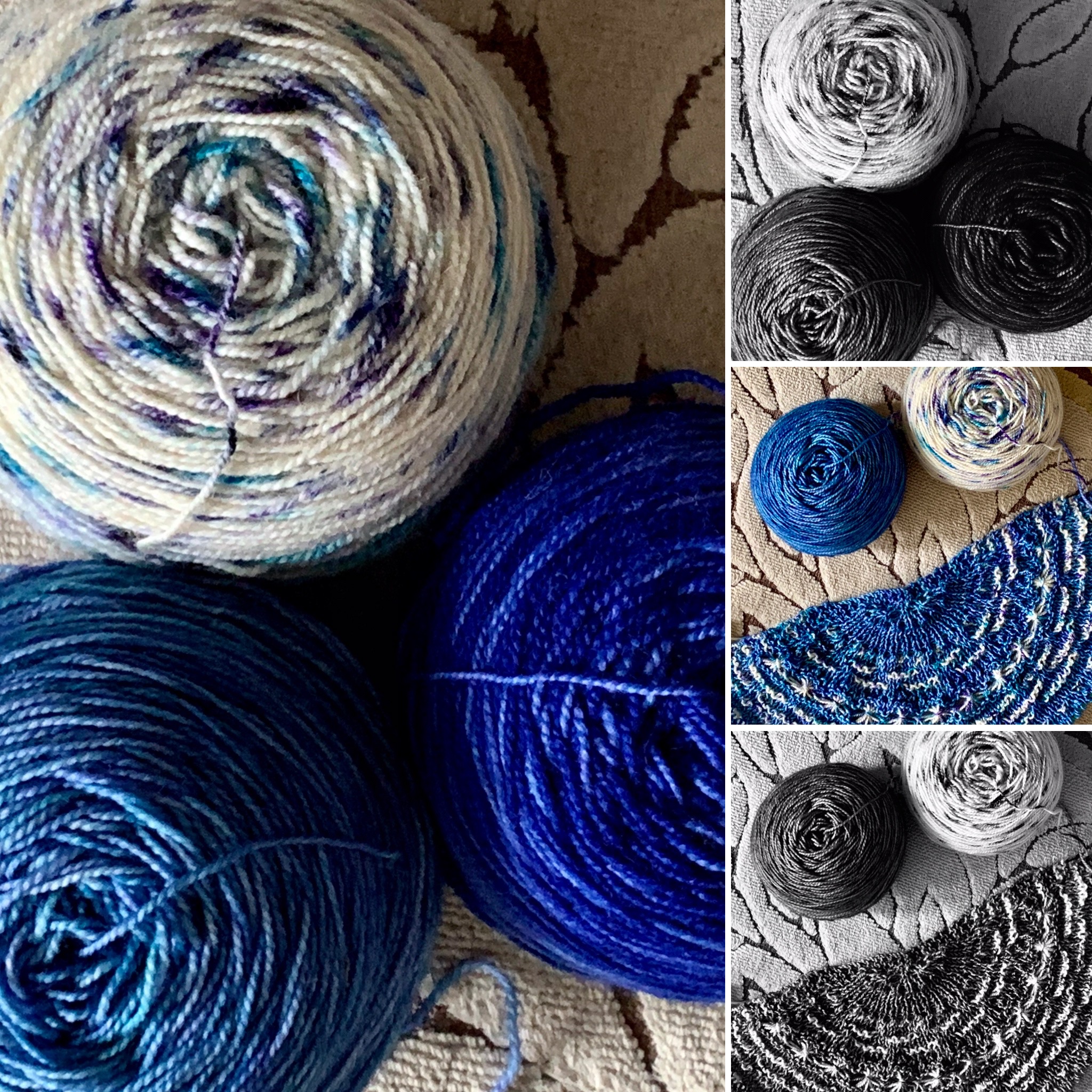
Remember this? I really liked how the smaller/whiter ball was popping against the dark blue background, but I didn’t have enough to knit a whole shawl with this leftover half ball.
The more heavily speckled/creamier ball had more color than I liked in the big stars. (This was also against a lighter background, so it had even less pop.) What to do?
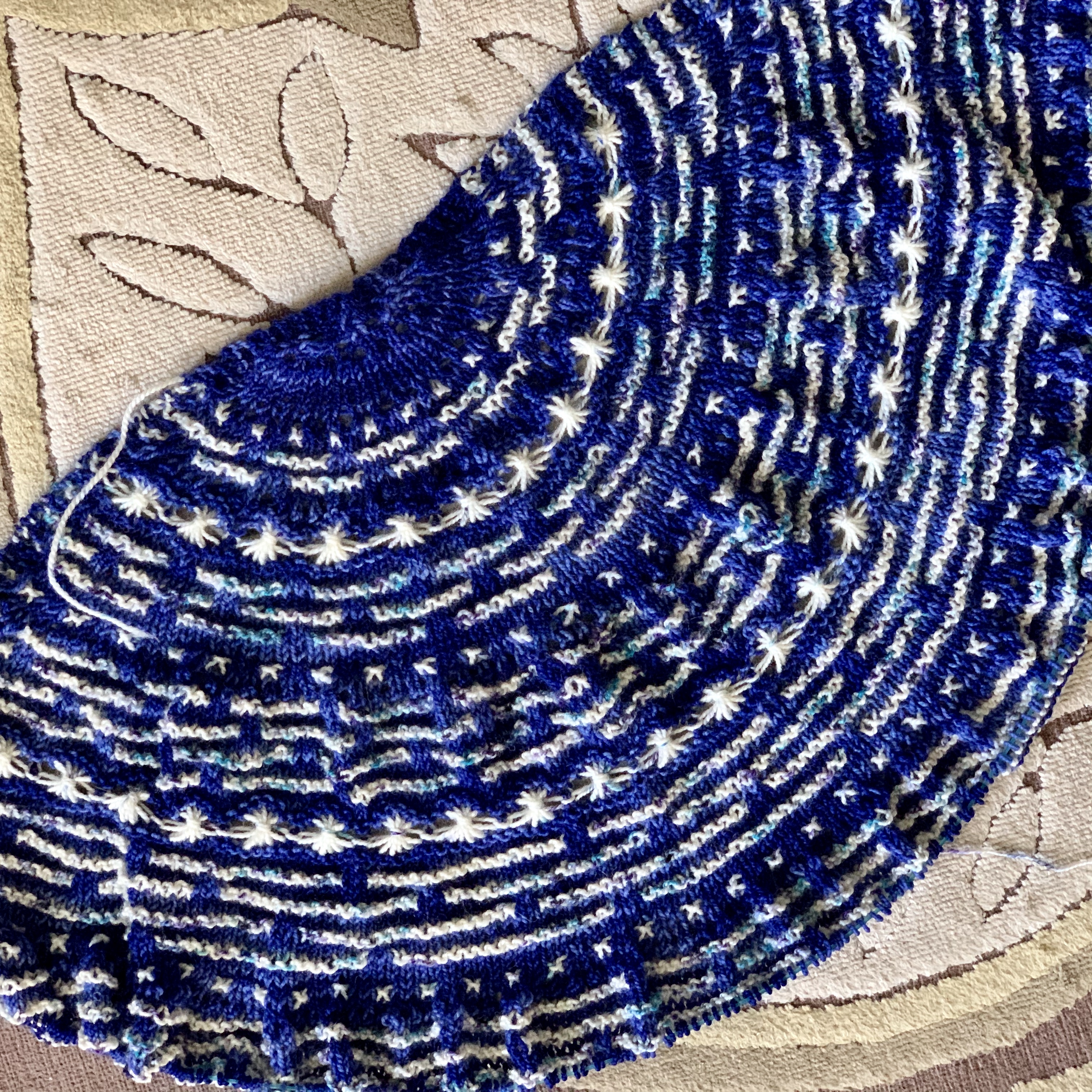
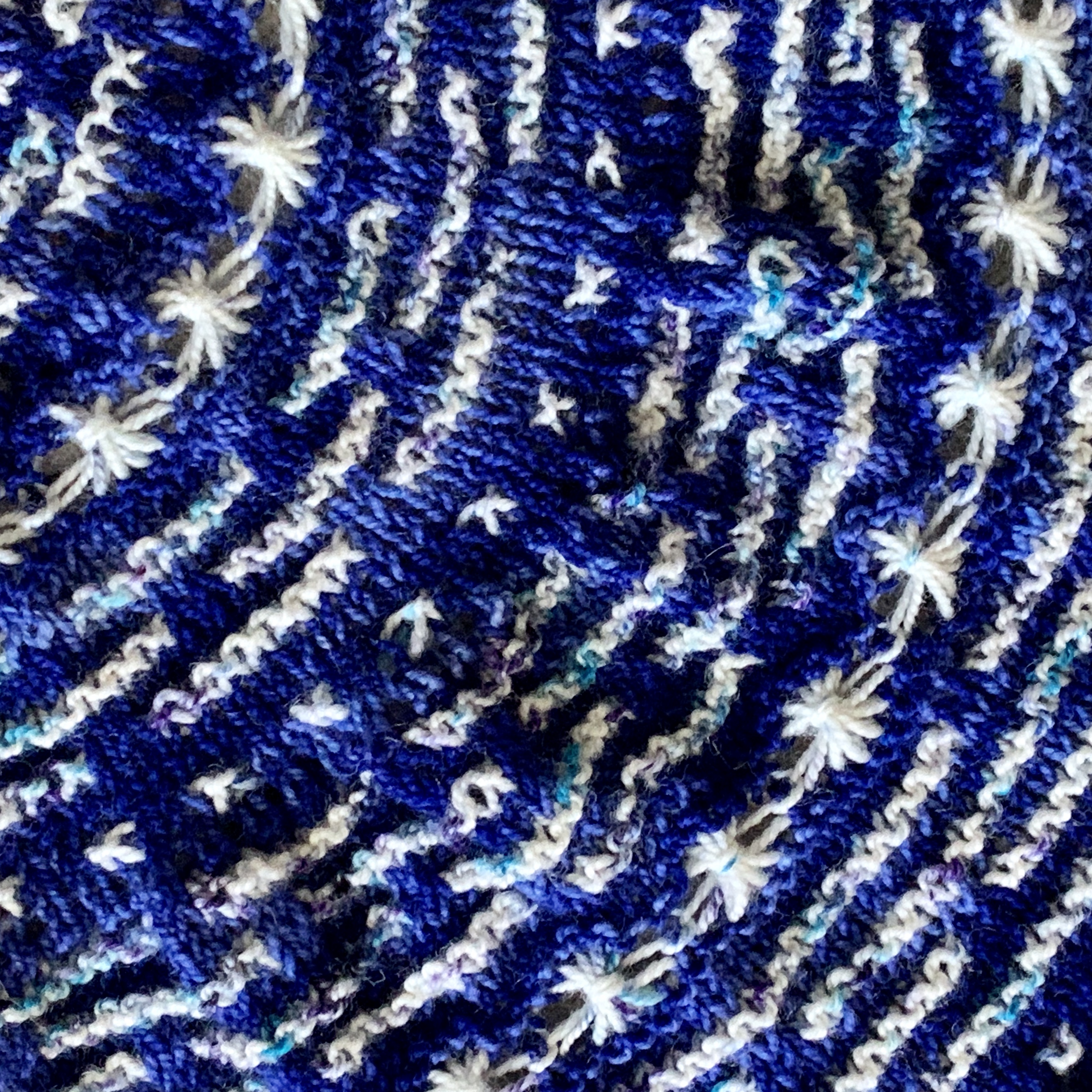
Mix and match! I’m using the whiter/less speckled yarn for the single stitch stars, and for the big star stitch rows. I’m using the specklier yarn for the star trails, and I love how it looks. It’s blending really well. I didn’t take out the very first set of star trails; they’re so short that the less speckled yarn was a better choice there.
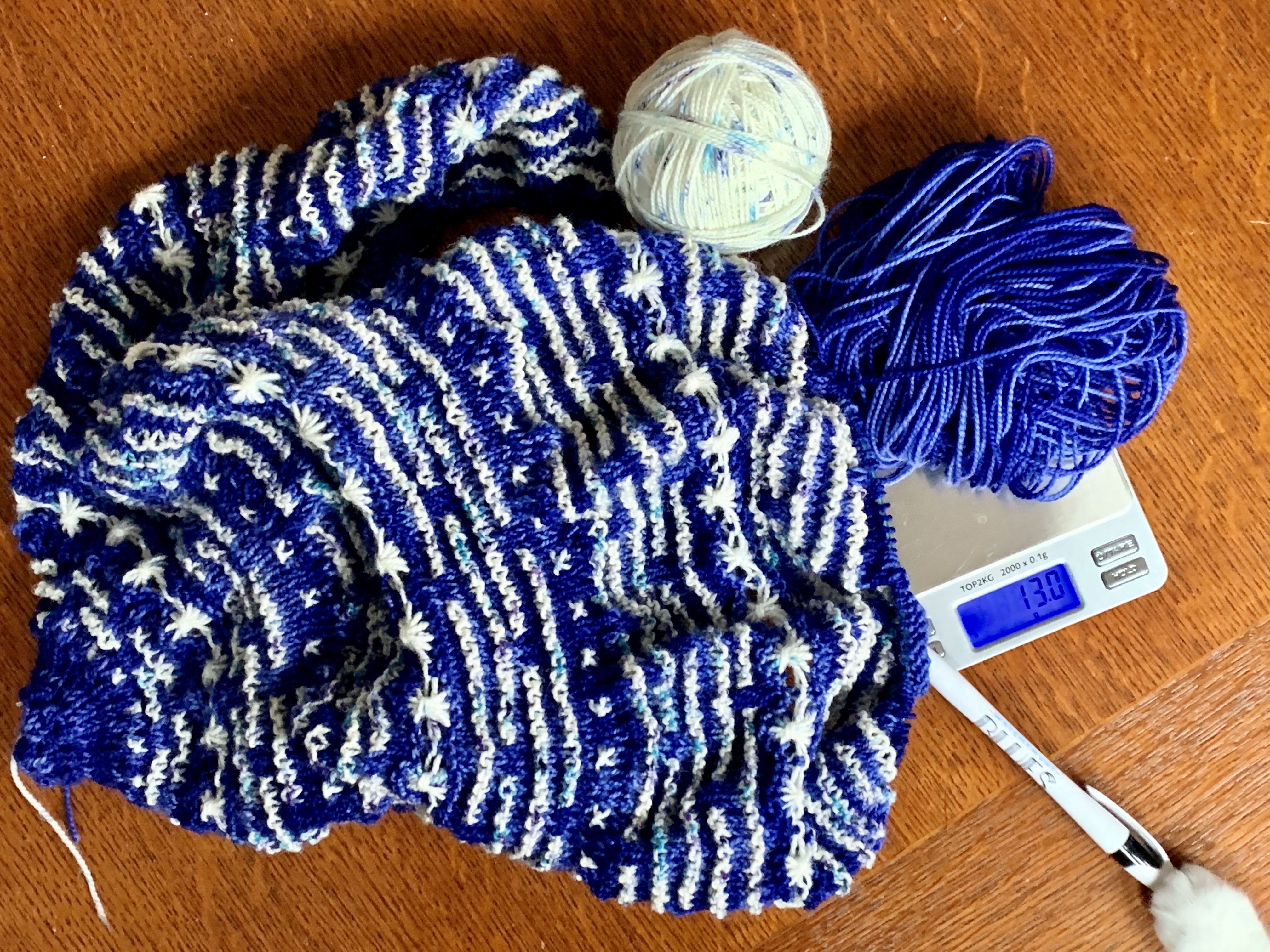
I’ll still keep the overall combined contrast color to 100g for test knit math purposes. But this night sky version is making me very happy.
I have enough of the blue to finish as written, but not enough to add any extra rows. Good to know! I like that I can figure this out without playing yarn chicken. Instructions for weighing (ha!) your options are in the pattern.
Note that Biscuit is helping me here.
Are you interested in a KAL? I think this could also be a fun class; it has a few interesting techniques, and you’d learn them all at the beginning. Hmmmm…..
I accidentally finished my pink Love Note before Monday’s Zoom knit nite, so I was desperate to put something else on the needles. This is the downside of being a monogamous knitter.
I poked through my tiny stash, and decided to cast on a second Half the Knit Sky, just to see how far 2 400 yard skeins could take this. The original only has 388 yards in the gradient sparkle skein.
You know the mono tonal contrast camera trick? Put your camera phone in monotone to see if your colors have tonal contrast. Based on this picture, it looks like the speckled yarn would show up well against either of the two blues I have here. I opted for the lighter of the two, because I had tried the darker before and I thought the colors looked muddy together.
But you really don’t know until you try it. Where are my stars?
I think the issue is in the dye lot. The one I’m using is in the upper corner. It looks like the speckles are longer/heavier than the speckles on the one in the lower corner, which is leftover from my Both Sides Now shawl. The light background of the speckle is an ok tonal pop with the background color, but the big star stitch stars are getting lost because there’s too much of the speckle dye in them.
I only have half a ball (44g) of the older version, not enough to do the whole shawl.
I really like the way the older speckle yarn pops off the dark background. When I swatched the dark yarn before with the new speckle, I thought it was a bit muddy. Whyyyyy?
The other difference between these two speckled yarns? The older one is whiter, and the newer one has a more natural/cream background. This isn’t a knock on the yarn; dye lots can vary quite a bit. It’s only when you have your heart set on a particular vision that it becomes problematic.
I do think the darker background is the better choice.
What to do? I think I can make this work if I use the whiter yarn for the single stars and the tall star stitch rows, as well as the final border. I can use the creamier, more heavily speckled yarn in most of the star trail rows (the long white lines). That would be like natural variation in the sky, and it would also vary the perceived length of the lines.
As with most knitting, I’ll have to try it and see. I just have to decide whether to rip back to the beginning of the second set of star trails, or let those bright trails stand. What do you think?
Find my patterns on Ravelry: Michele Bernstein Designs
Here are some of my favorites, and the newest. Many of my designs are also available through my Payhip store.