Tag Archives: tonal contrast

Tonal and color contrast, redux

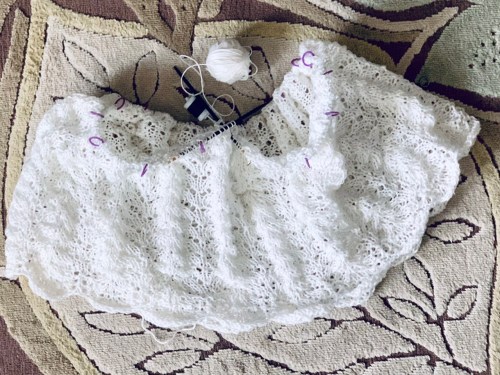
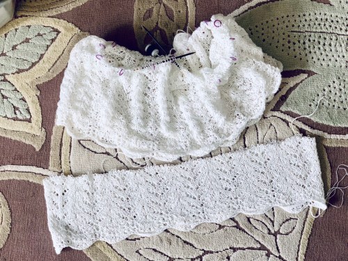
I’m back from Alaska with lots to blog, eventually. It will take a while to catch up!

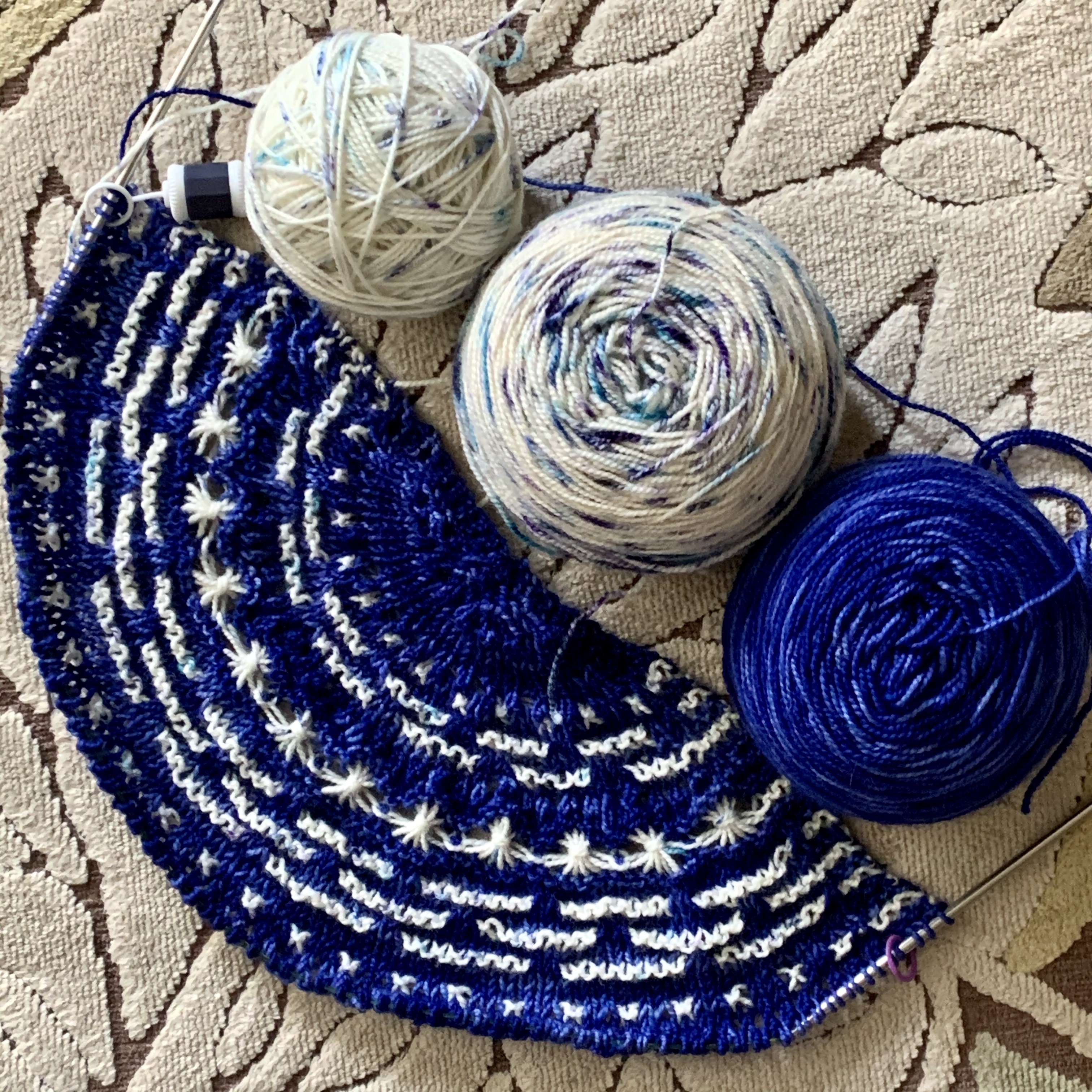
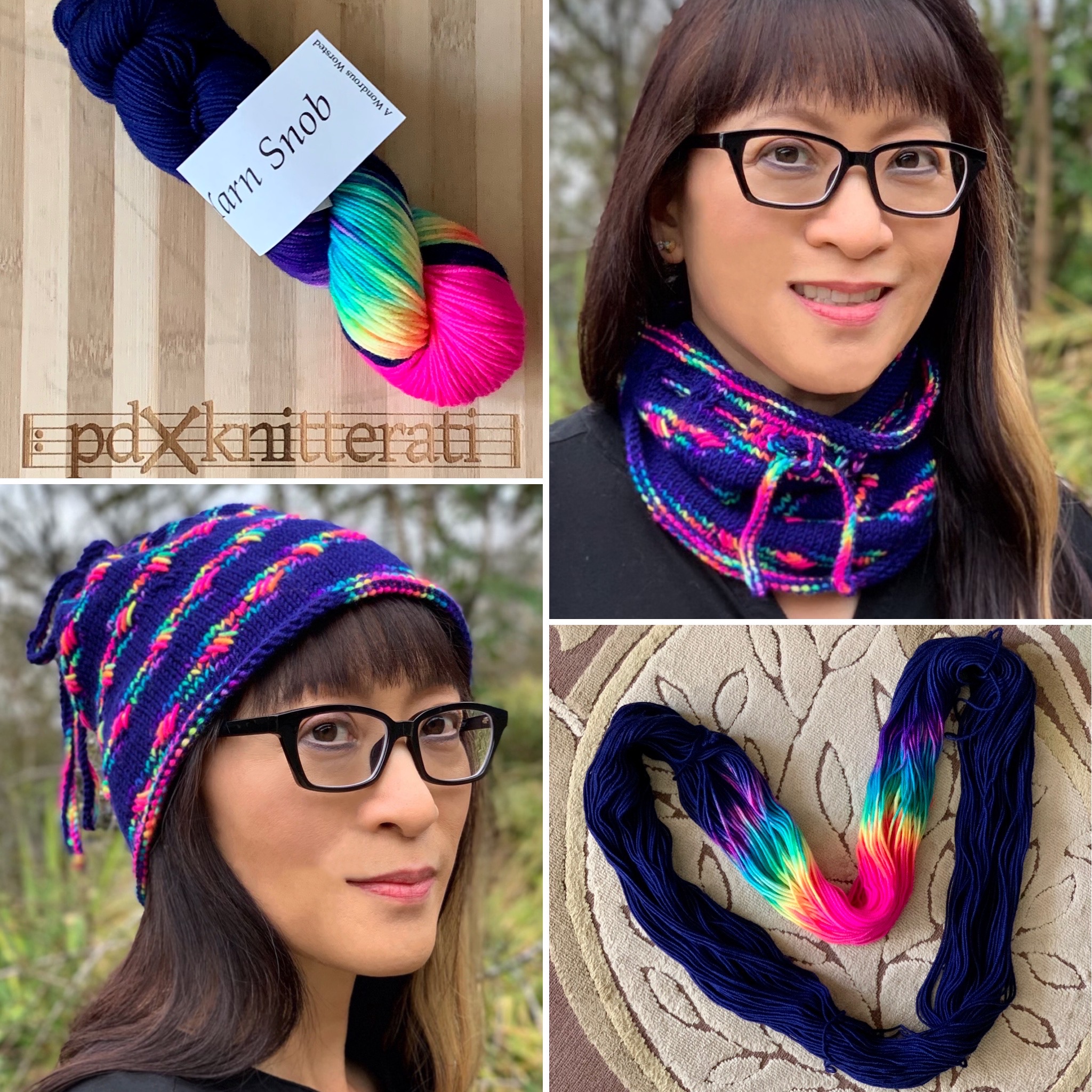
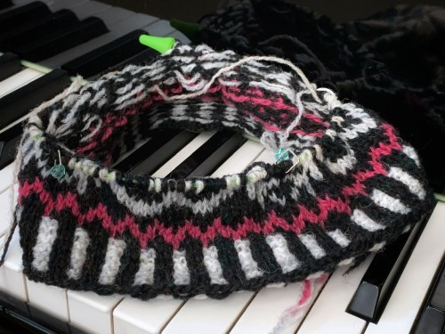
Remember I was looking for a couple social knitting projects to take with me? I didn’t knit much on my Slip Away Cowl sample; too much counting. But I worked on it in my stateroom at night, and a bit when I got back home.

I’m not happy with it; it needs more tonal contrast. Or color contrast, or something.

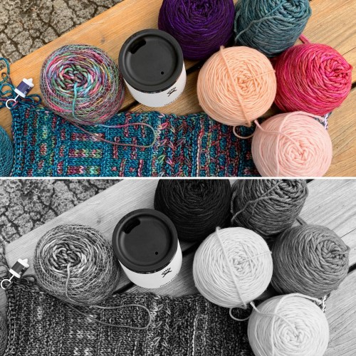
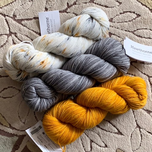
I’ll save the blue-green Solis (one of my favorite Malabrigo colors) for another time. The variegated Liquidambar needs to be the feature of this project. I lined it up with all my Rios leftovers that had enough to work this project.

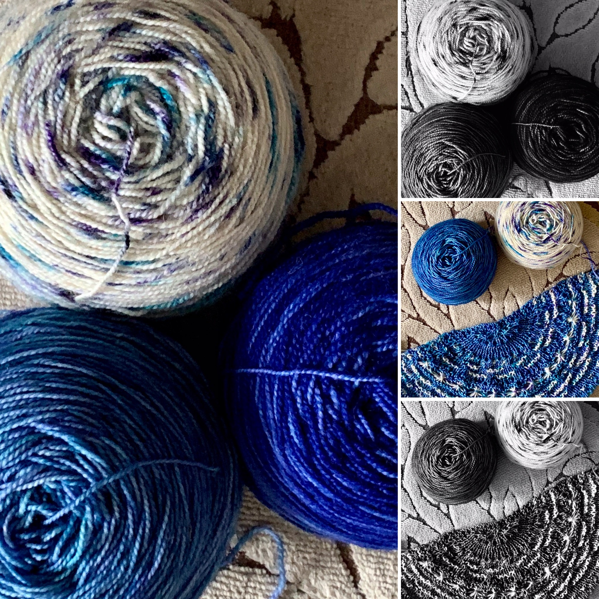
I thought that the deep purple would be perfect, that it would make the Liquidambar pop, but a few rows in I could see that it would all be too dark. I then tried the light pink, but it was so strikingly pale that it wanted to upstage the Liquidambar.

Onward to English Rose. I love how vibrant the pink/orange combo is. From the previous photo you can see that there’s not a lot of tonal contrast here, either, but I think the Liquidambar reads as blue/green overall (too similar to the Solis), and makes a better contrast with this deep pink/orange.

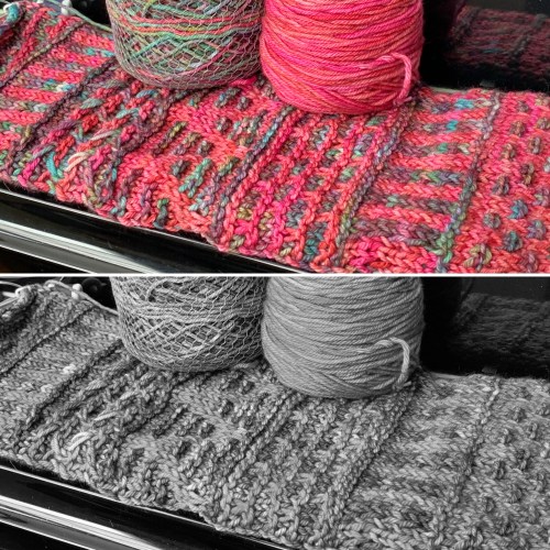
I can see the contrast better, both color and tonal. You can see it in the vertical stripe section in the grayscale photo. The garter/stockinette contrast helps move things along, too.

I tried to take a picture of just the knitting, but my camera keeps reading the pink incorrectly, so you’ll just have to trust me on this one for now. It’s very fun knitting, but I have to set it aside to work on my Buggiflooer Cowl before Sunday’s class.

If you’d like to learn about stranded colorwork with me, sign up here! Class is Sunday at 1:30 pm Pacific, via Zoom.

If you’d like to learn more about slip stitch knitting, I’m teaching a Zoom class Friday Oct. 27 for Virtual VKLive, featuring the Slip Away Cowl. Registration isn’t open yet; I’ll let you know! The Slip Away Cowl is a fun introduction to colorwork. It looks complicated, but it’s slip stitch knitting. Only one color is used per row, which means there is no stranding or juggling two colors in the round.

More cruise blogging soon!

Keeping the faith?

The linen knitting continues.

The little 50g balls go pretty quickly. The knitting looks loose and crinkly, but I have this previously blocked swatch to remind me of how swingy, smooth, and drapey it’s going to be.

Do I have it in me to carry on? MAYBE! This is my ”for fun” knitting, which has nothing to do with work or publishing a pattern. That means there’s no deadline, and no reason to finish it…unless I really want to. We’ll see if I get distracted! I do have a design to work on, with this yarn…

Knit Picks Hawthorne in Spark Speckle, and Slate and Compass Kettle Dye
iPhone

Do you know the trick for checking your tonal contrast? Put your camera phone into monochrome, and that will give you a good idea if your yarns are contrasty enough. On an iPhone, use the carat at the top to change the menu at the bottom. The 3 overlapping circles (middle picture) indicate color choices. Swipe right until you get to MONO (that’s what it says in the 3rd picture; sorry it’s fuzzy). You can also do this after taking a picture too, using the edit feature when looking at your pictures. You’ll get something that looks like this.

Here I have a light and two mid-range. The gray surprised me; I thought the gold would be darker of the two mid-tones. I think I’ll aim to use each of the kettle dyes with the speckle, but not necessarily with each other. I don’t really know yet, though. Swatching is in order! I think it’s either a shawl or a shawlish cowl like Cosette, and I’d like it to have a bee theme, because of the honey colors.

Onward!

Tonal contrast and dye lots

I accidentally finished my pink Love Note before Monday’s Zoom knit nite, so I was desperate to put something else on the needles. This is the downside of being a monogamous knitter.

I poked through my tiny stash, and decided to cast on a second Half the Knit Sky, just to see how far 2 400 yard skeins could take this. The original only has 388 yards in the gradient sparkle skein.

You know the mono tonal contrast camera trick? Put your camera phone in monotone to see if your colors have tonal contrast. Based on this picture, it looks like the speckled yarn would show up well against either of the two blues I have here. I opted for the lighter of the two, because I had tried the darker before and I thought the colors looked muddy together.

But you really don’t know until you try it. Where are my stars?

I think the issue is in the dye lot. The one I’m using is in the upper corner. It looks like the speckles are longer/heavier than the speckles on the one in the lower corner, which is leftover from my Both Sides Now shawl. The light background of the speckle is an ok tonal pop with the background color, but the big star stitch stars are getting lost because there’s too much of the speckle dye in them.

I only have half a ball (44g) of the older version, not enough to do the whole shawl.

I really like the way the older speckle yarn pops off the dark background. When I swatched the dark yarn before with the new speckle, I thought it was a bit muddy. Whyyyyy?

The other difference between these two speckled yarns? The older one is whiter, and the newer one has a more natural/cream background. This isn’t a knock on the yarn; dye lots can vary quite a bit. It’s only when you have your heart set on a particular vision that it becomes problematic.

I do think the darker background is the better choice.

What to do? I think I can make this work if I use the whiter yarn for the single stars and the tall star stitch rows, as well as the final border. I can use the creamier, more heavily speckled yarn in most of the star trail rows (the long white lines). That would be like natural variation in the sky, and it would also vary the perceived length of the lines.

As with most knitting, I’ll have to try it and see. I just have to decide whether to rip back to the beginning of the second set of star trails, or let those bright trails stand. What do you think?