
I’m on the second knit of an upcoming assigned pooling shawl design; I won’t show you the whole thing until I’m ready to ask for test knitters. First I need to knit through again to confirm some numbers.
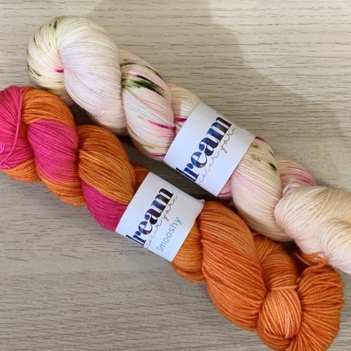
I started with this color combo back in March or April. So pretty!
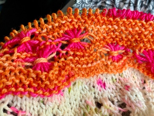
There’s not a lot of tonal contrast between the orange and the pink…
Which meant it didn’t make much difference if I had garter bumps on the edges of the star/flower stitches.
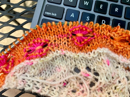
In fact, it added a little something-something that I kind of liked.
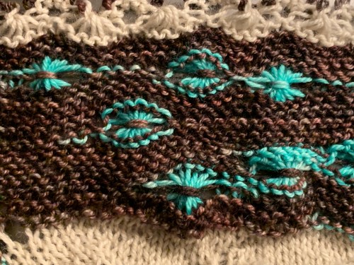
But in my second knit, I really didn’t like those contrasty garter bumps. They looked kind of like toothy maws, waiting to bite. No thank you!

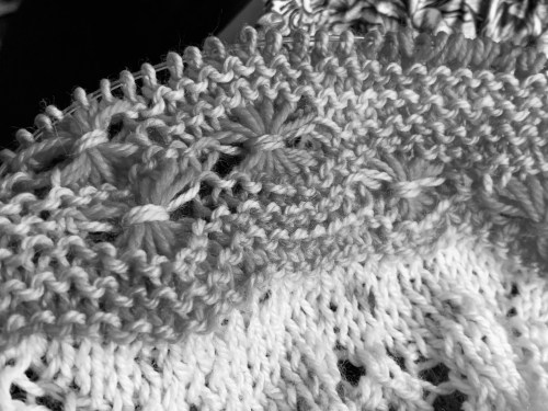
So I’m editing the draft pattern to make all of the stars/flowers smooth on the top and bottom edges. (Looks like I may have missed one up there, oops.) This will look good in both the less contrasty and more contrasty yarns.
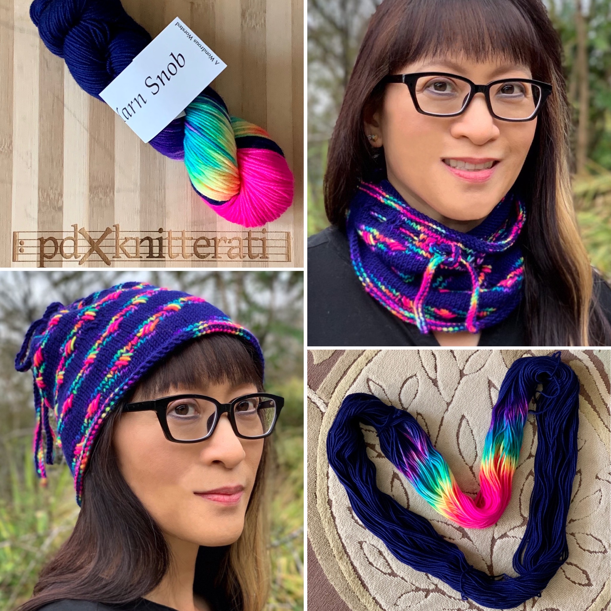
This design has been through a lot of fussing since I began it; I really wanted to make the assigned pooling sing as the star of the show. I think all the do-overs will be worth it in the end. The orange/pink version blocked out beautifully. I’m so glad, because I didn’t know if I would like the finished shawl until I blocked it. That was a leap of faith to keep knitting til the bitter end.
I’m looking forward to sharing this with you soon!
If you like thinking about tonal contrast, check out this previous post and this post about picking colors for my Soldotna Crop sweater in 2019.


I derive immense satisfaction from your problems-with-solutions, Michele ! – and from the fact that a true expert like you can make little errors and not be too proud to point them up ! 😀
You are a Real Teacher !
XO
I make the mistakes so you don’t have to! That’s my design ethos…
<
div dir=”ltr”>
<
blockquote type=”cite”>
This looks exciting
So, so pretty.
Very cool!