
I don’t knit from other designer’s patterns very often; usually I’m designing something of my own. But every once in a while a design will catch my attention, and I just have to knit it! The last time it was Mary Jane Mucklestone’s Stopover. I loved it so much I knit two of them.
This time? Caitlin Hunter’s Soldotna Crop is calling my name. I bought yarn for it in June. But I set it aside so I could design and knit a linen top first. That’s the incentive plan: Work first, then play.

Here’s the yarn I bought in June. Iris, Spooky Hue, Nickel, and Fresh Cut. I was a little worried about the gray and green; they don’t have much tonal contrast, and I really wanted to use the green for the arrow line across the yoke. Per the pattern, it would be paired with the gray.
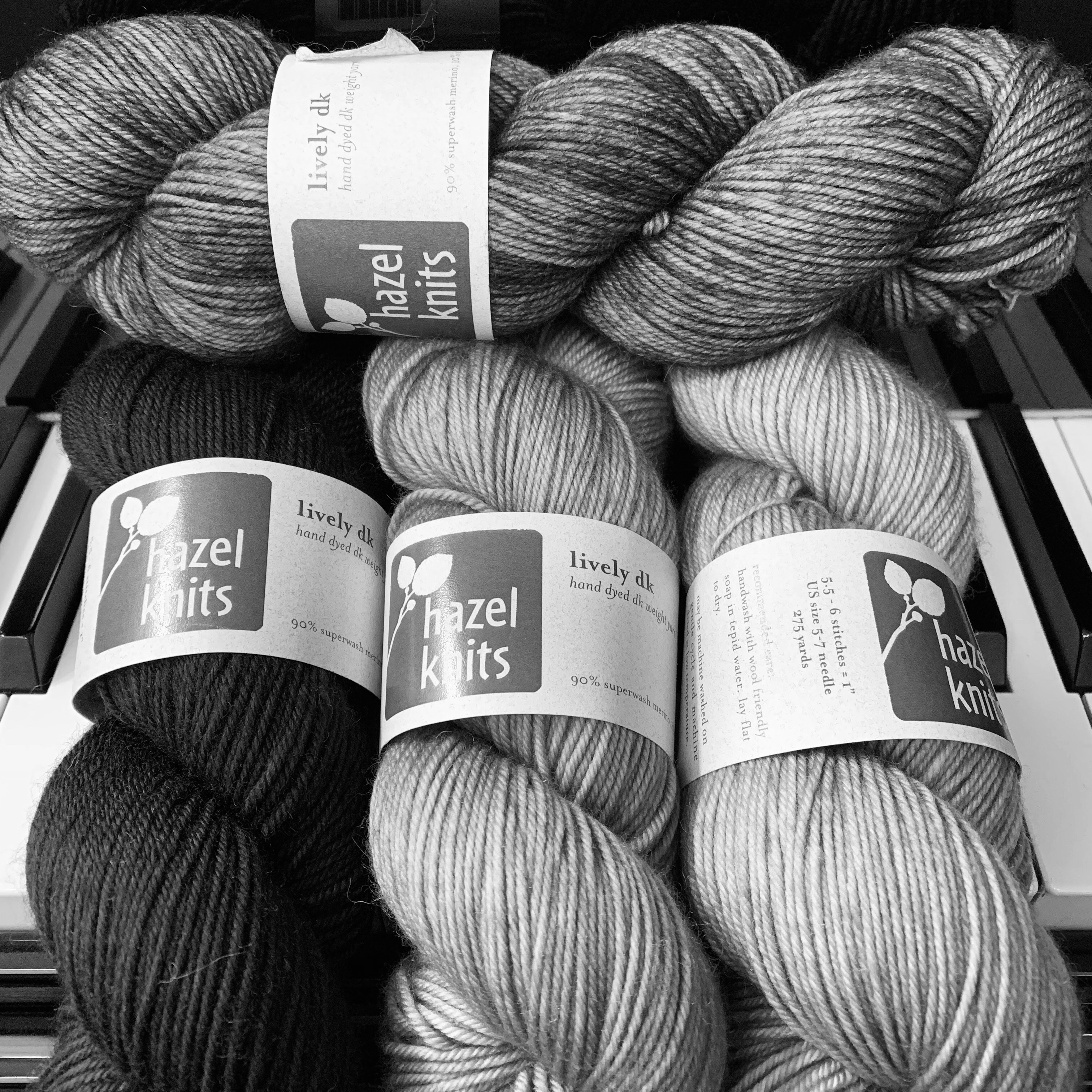
Not much contrast there, right? But I knew I wanted the watercolor-y light purple Iris for the main part of the body, and I thought I wanted the dark purple to pop off of that.

I ignored my warning bells and cast on. Did I do a proper washed and blocked gauge swatch? No. Do as I say, not as I do! Sometimes just jumping in and starting is as good as a gauge swatch. I don’t mind ripping.
The first attempt used the recommended size US 5 needles, and it was tighter than it should have been. So I started over on a US 7. Oh, with a provisional cast on. I’ve paged through a lot of Ravelry project pages, and the one complaint is that the neckline is very high. So I’m skipping the ribbing and the short rows, and just beginning right below the colorwork. I’ll figure out the neck treatment later.
When I got to the green/gray arrow, there was no contrast at all. Guess I should have listened to those warning bells. Also, I decided that I didn’t want the dark purple as a background at the beginning; the whole sweater was bringing me down. Too autumnal, or even wintery. So I went back to Twisted, and bought a skein of Nekkid to replace the gray.
I still want the light purple as the main part of the body. And I wanted way less of the dark purple, so I’ll use that for the arrow. That’s the least used color. The question is: Nekkid or Fresh Cut for the beginning and the interplay with the light purple?

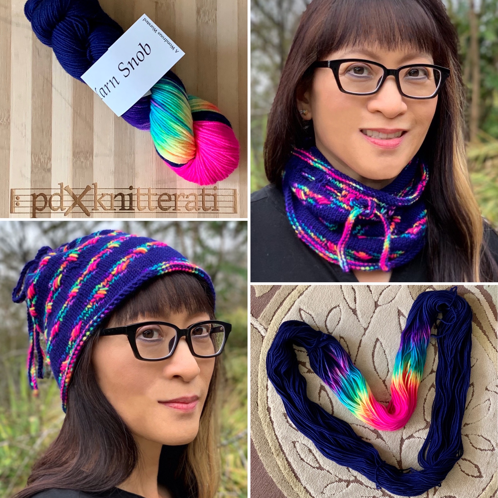
I started with Nekkid, and it felt like the purples were a stripe on a white sweater. Pretty contrasty! In this color scheme, the arrow would be dark purple against green, which I would love. Should I knit a little further? As I said, I don’t mind ripping!
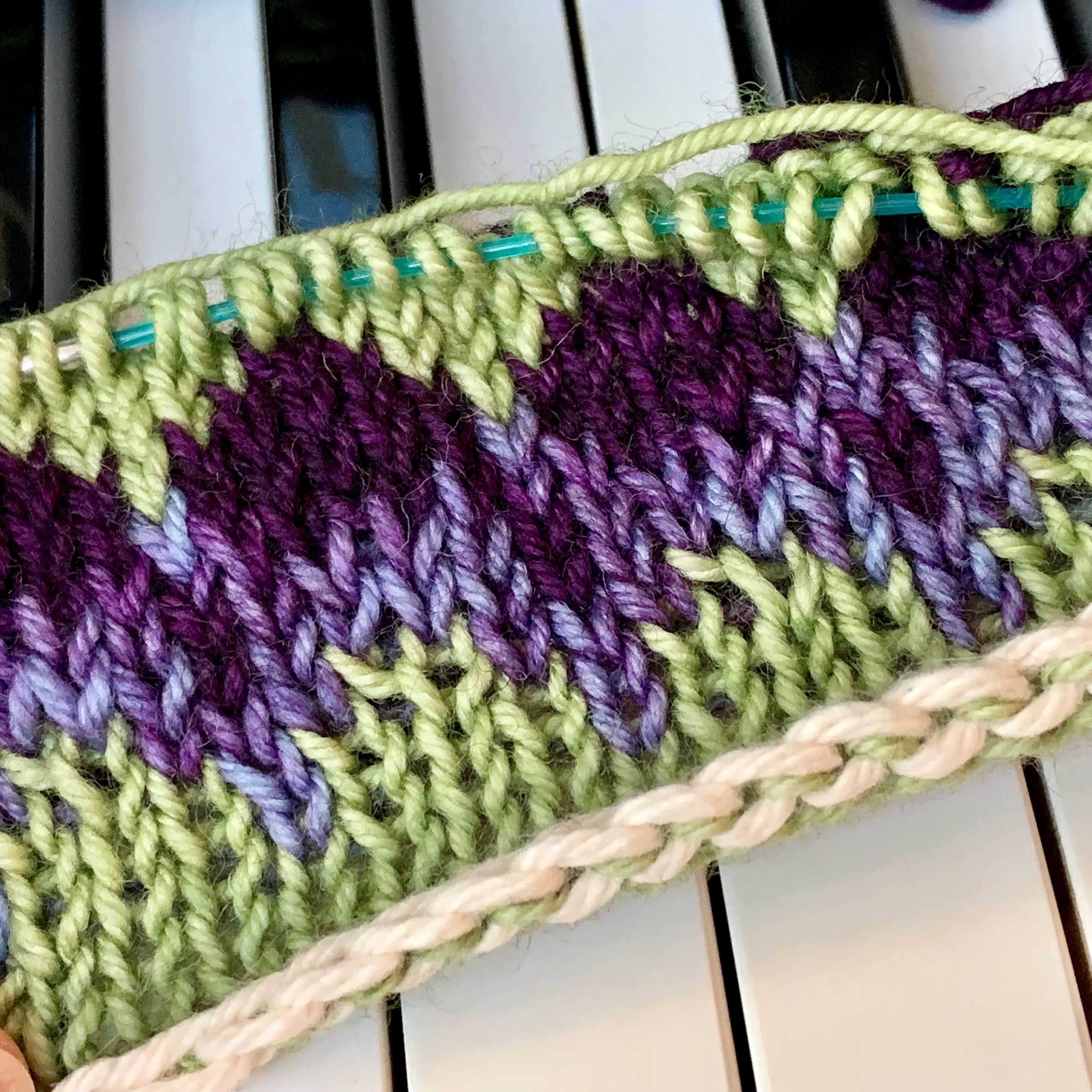
I also started with green, and the combo of this and the light purple made me think of sugared violets. Beautiful! I like how everything seems to blend. But now the arrow would be dark purple against Nekkid, which is very contrasty, and not quite as pleasing as purple against green.

So far, I’ve decided to go with the green beginning. It feels more blendy/cohesive. And the contrasty arrow will really stand out. But of course I’m having second thoughts. There might be more green than I want here. I may go and knit a little further on the other piece and see what happens. Which do you like?
I find color to be such an adventure, and so hard to predict how colors will interact until I try it. How about you?
I never did wash and block any of these beginnings. I guess it will fit…or it won’t!
Kittiwake, my linen top, is coming in August! I’ve knit two of them. The pattern has been edited, and test knitter Ann just got her yarn and is knitting away. I’m looking forward to sharing that with you! Soon!


I love all of your experiments! The contrast of dark purple and green is so nice. The last combination will be interesting to see with the light watercolorish purple…the green and white section is a little pale for me, but with the rest of the bands and the body of the sweater, it may balance out perfectly. I’m learning from your ‘swatching’! Thanks! I’m looking forward to the linen shell pattern!
I like the greener one.
That turned out to be my favorite, too! but I had to knit for a while more on the white one to decide.
>
Your Soldotna crop is off to a beautiful start! I like the greener one as well. Though both are lovely. Always good to have some fun playing with a project 🙂
I love the greener one as well. I like your color choices and it’s interesting how different they can look together and how one can allow another to shine.
Color is so interesting that way. I really do have to figure it out by trial and error. Eventually it all comes together!
>