
Oh, that little voice that says, “Are you sure that’s what you want?”
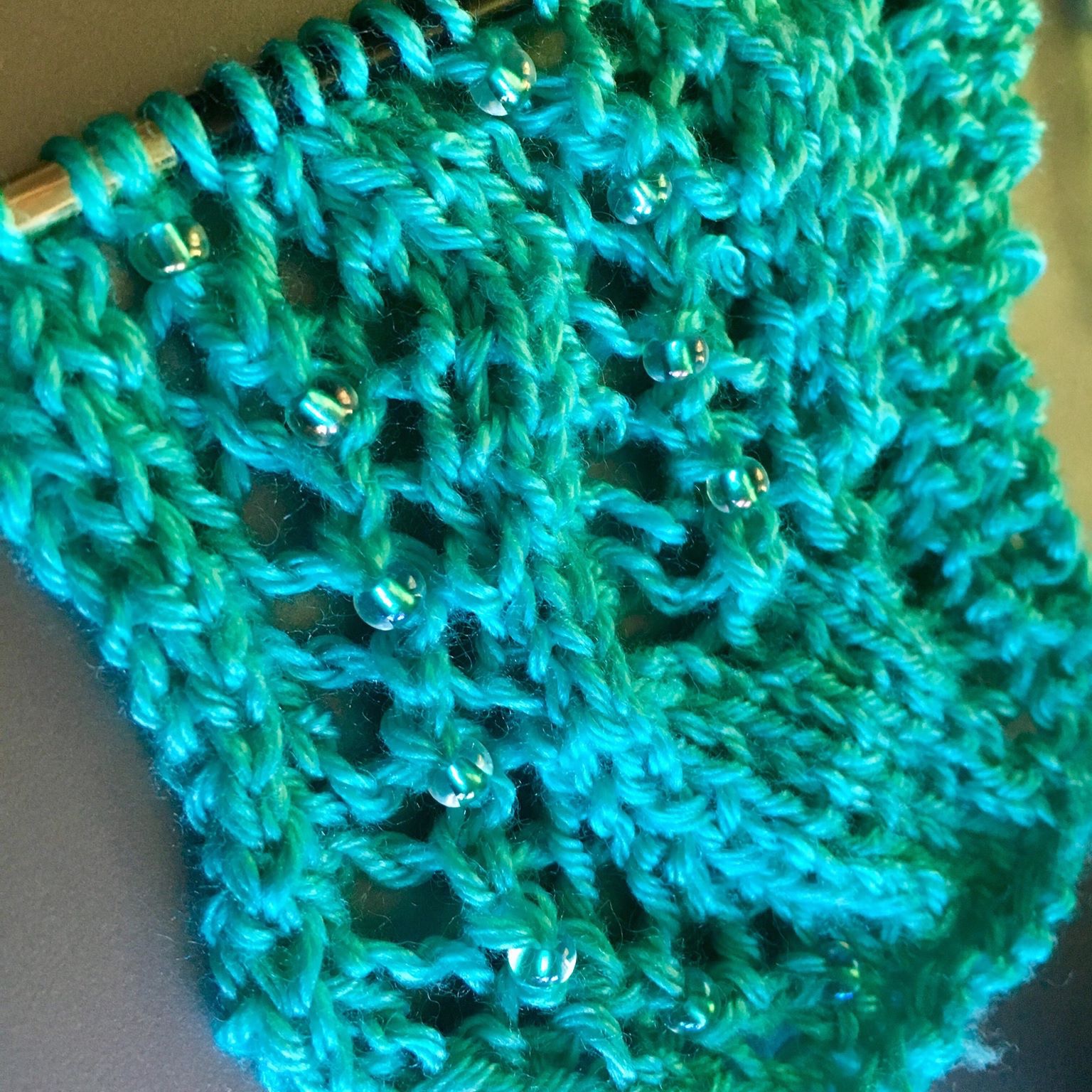 Green beads, green yarn
And you say, “Maybe?”
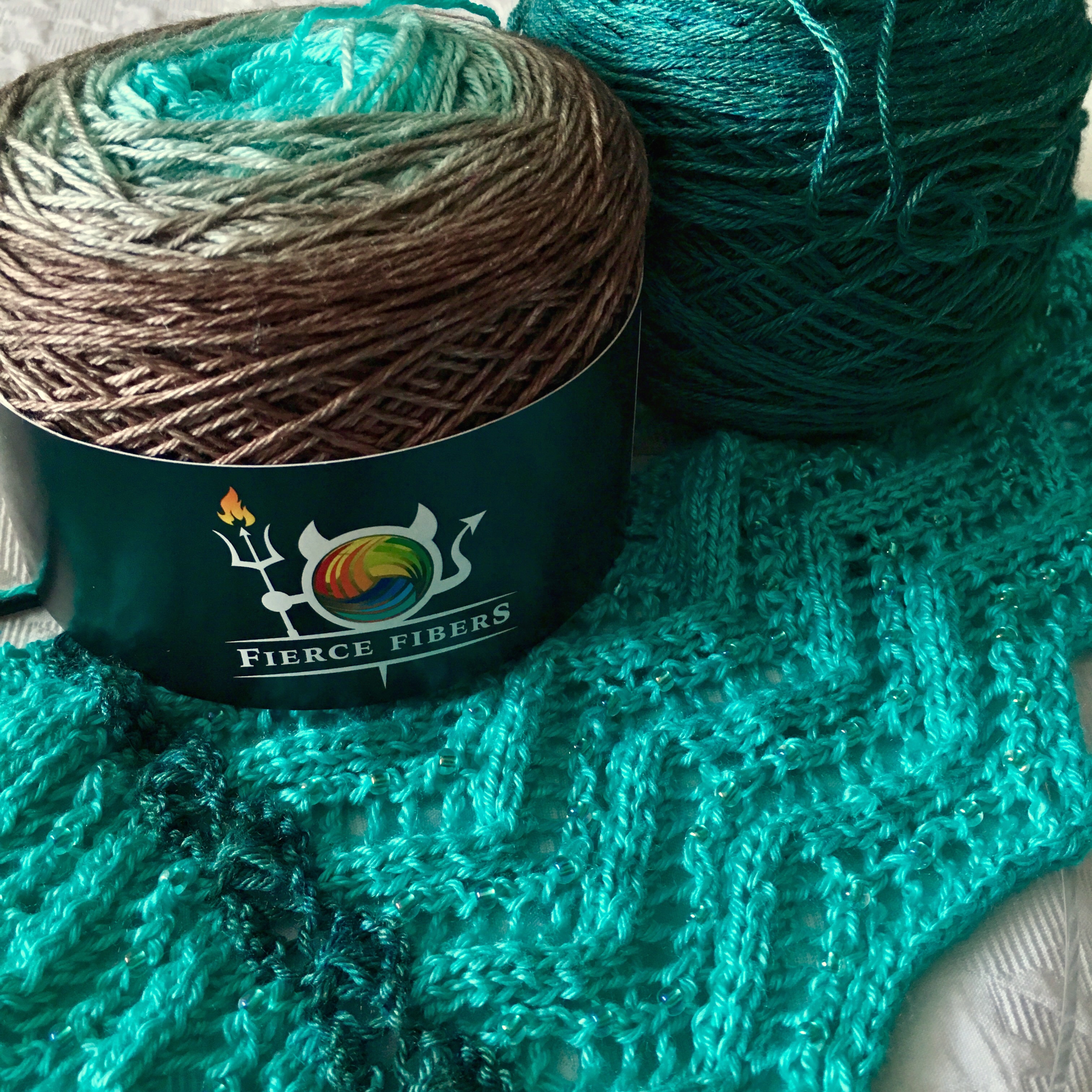 On our way with green beads, green yarn, and contrasting green yarn
Commitment is just so hard sometimes. I decided this might need contrasting beads instead. The green silver lined beads don’t show on the very vibrant teal at this end of the gradient cake.
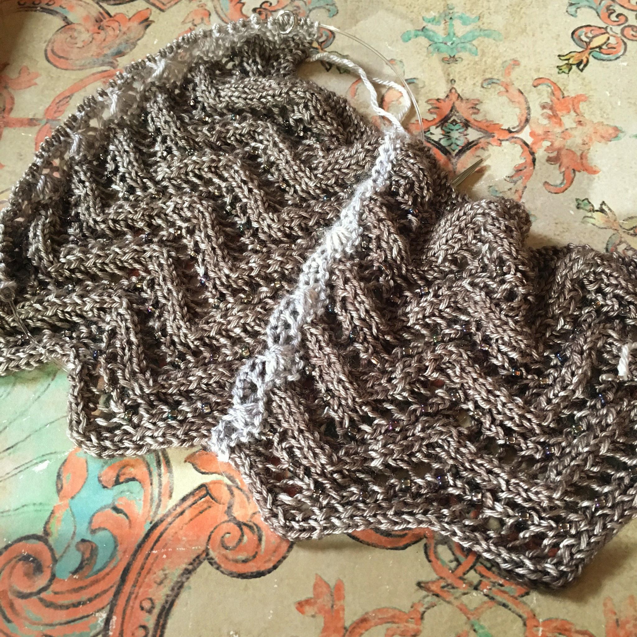
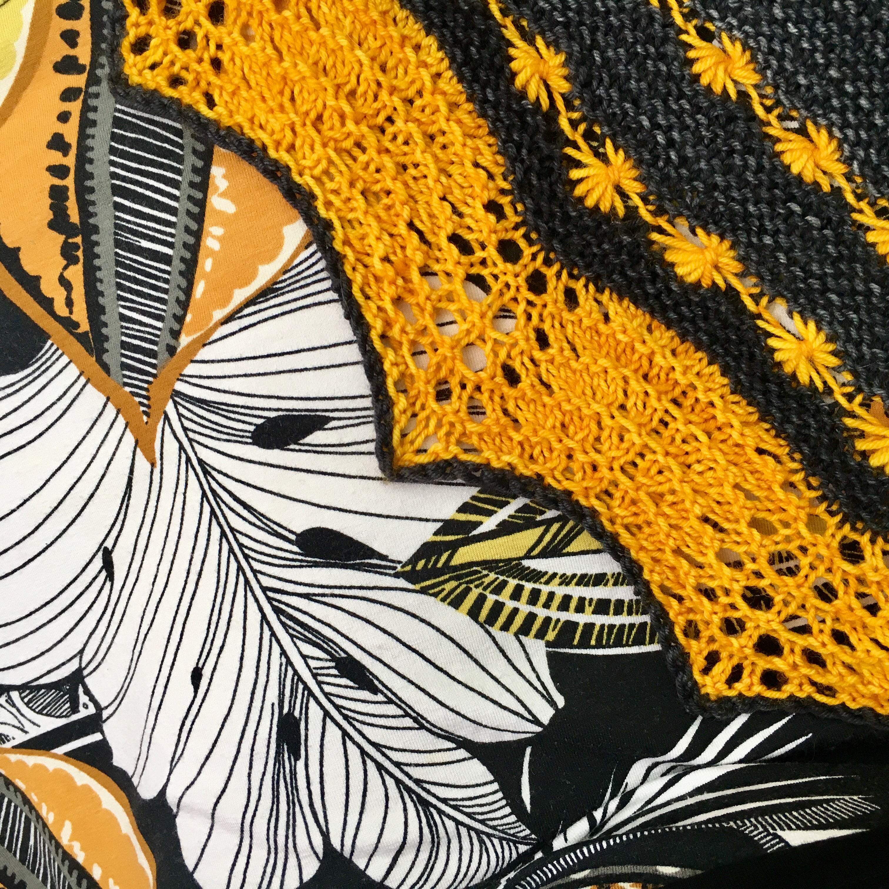
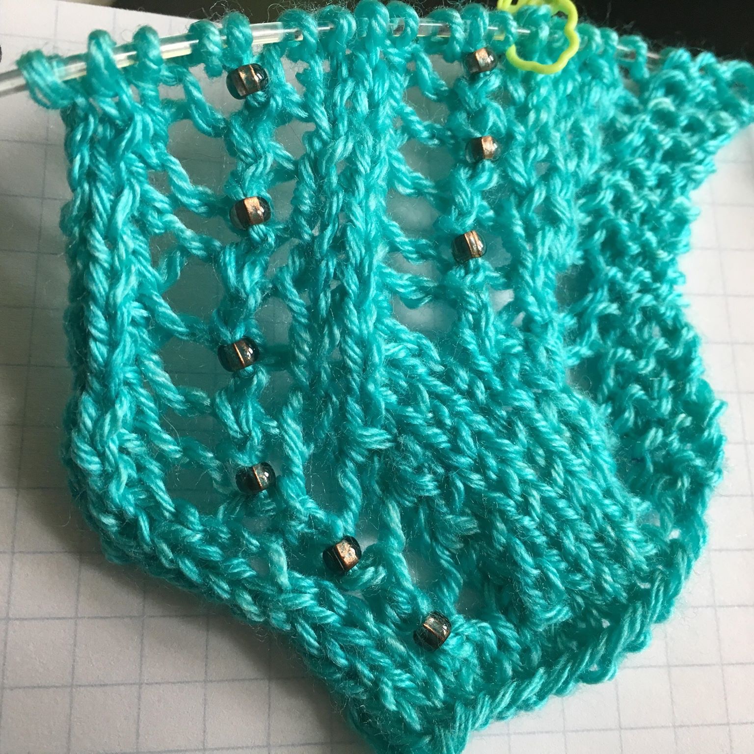 Brown beads on green yarn
 On our way again, with more contrast
But as I got further, I decided that wasn’t the look I wanted, either. So I started over. Again.
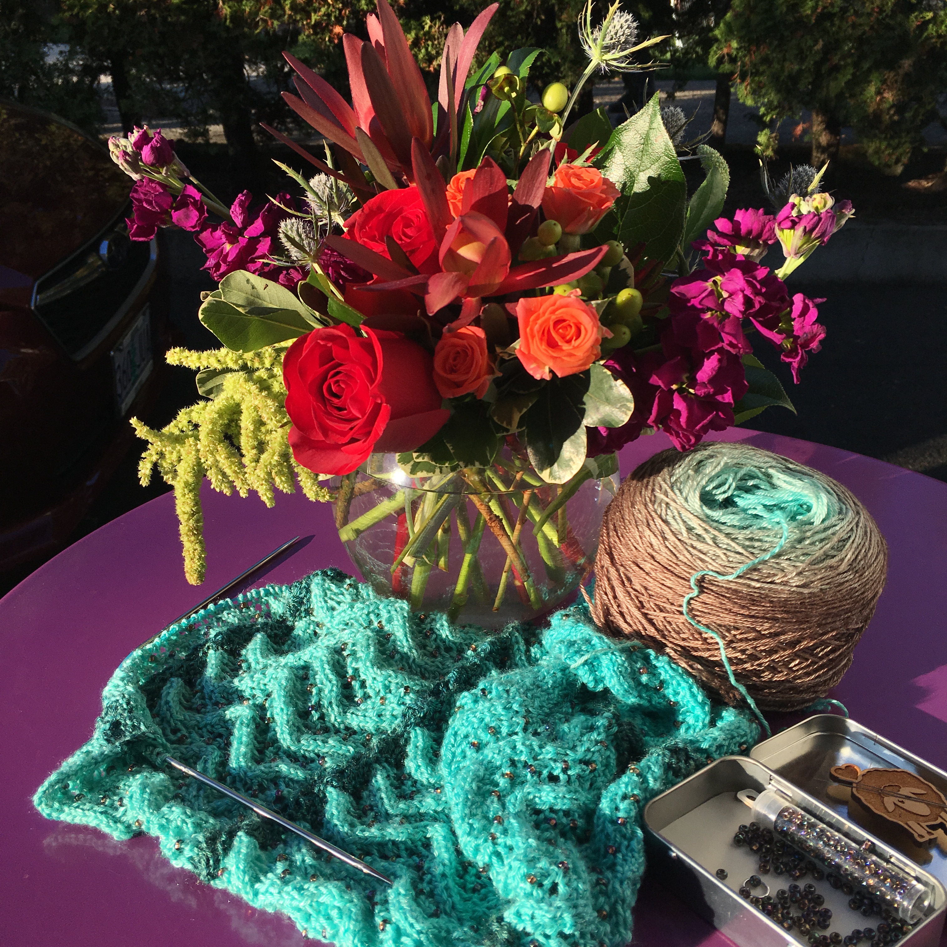
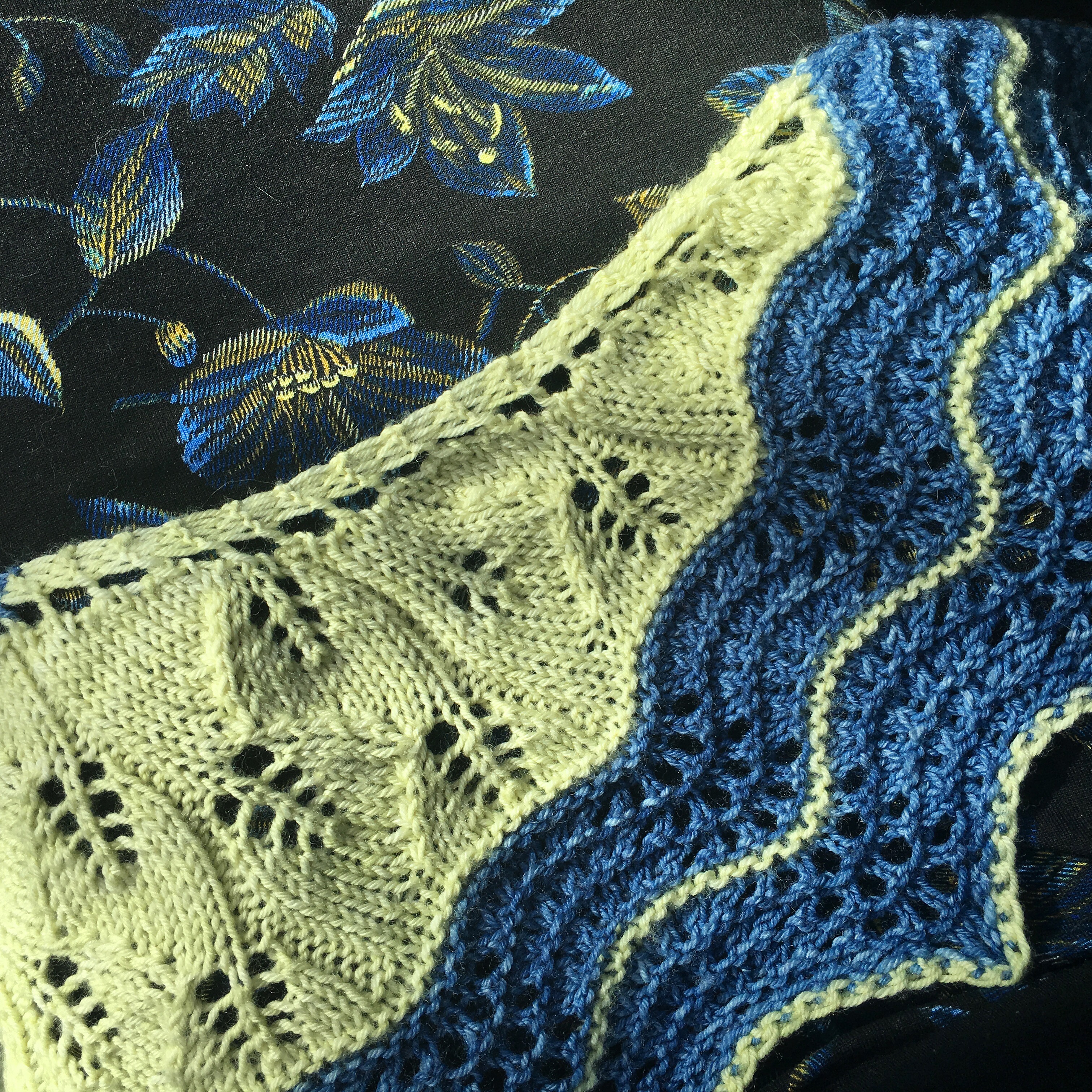
At the other end of the gradient this time. And I changed the yarn contrast color too, because I wanted it to feel less “tree” and more “sand.” Both the green and gray yarns work with the main cake; it’s just personal preference at this point.
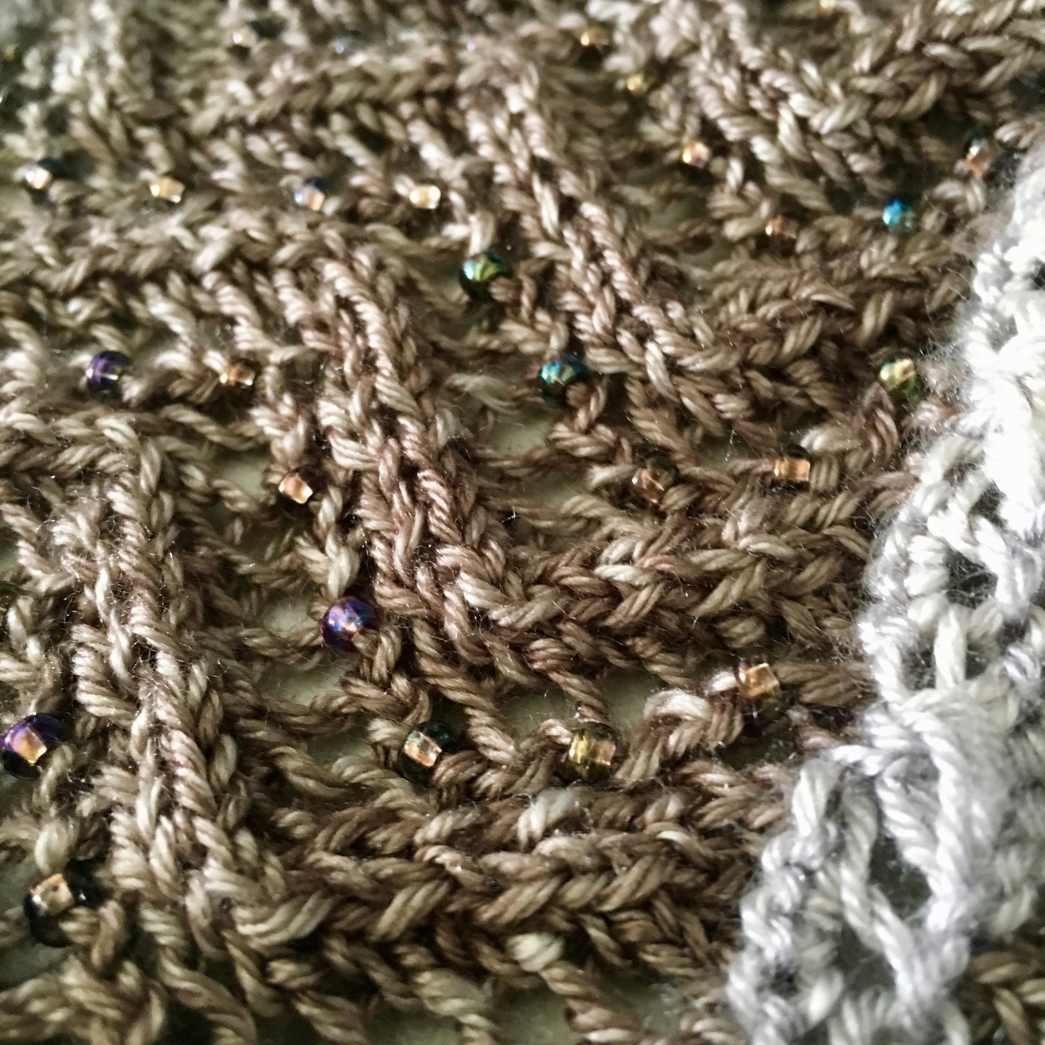
I love it! And I like these beads on it; they’re subtle but they reflect a lot of color.
I know that I won’t use every inch of the yarn cake (600 yards), so I won’t have my bead dilemma on that most vibrant end.
I’m generally pretty conservative in my yarn color choices. I usually choose my beads to be not too contrasty, too. You may like more pop in your knitting. There’s no one right way; do what makes you happy!
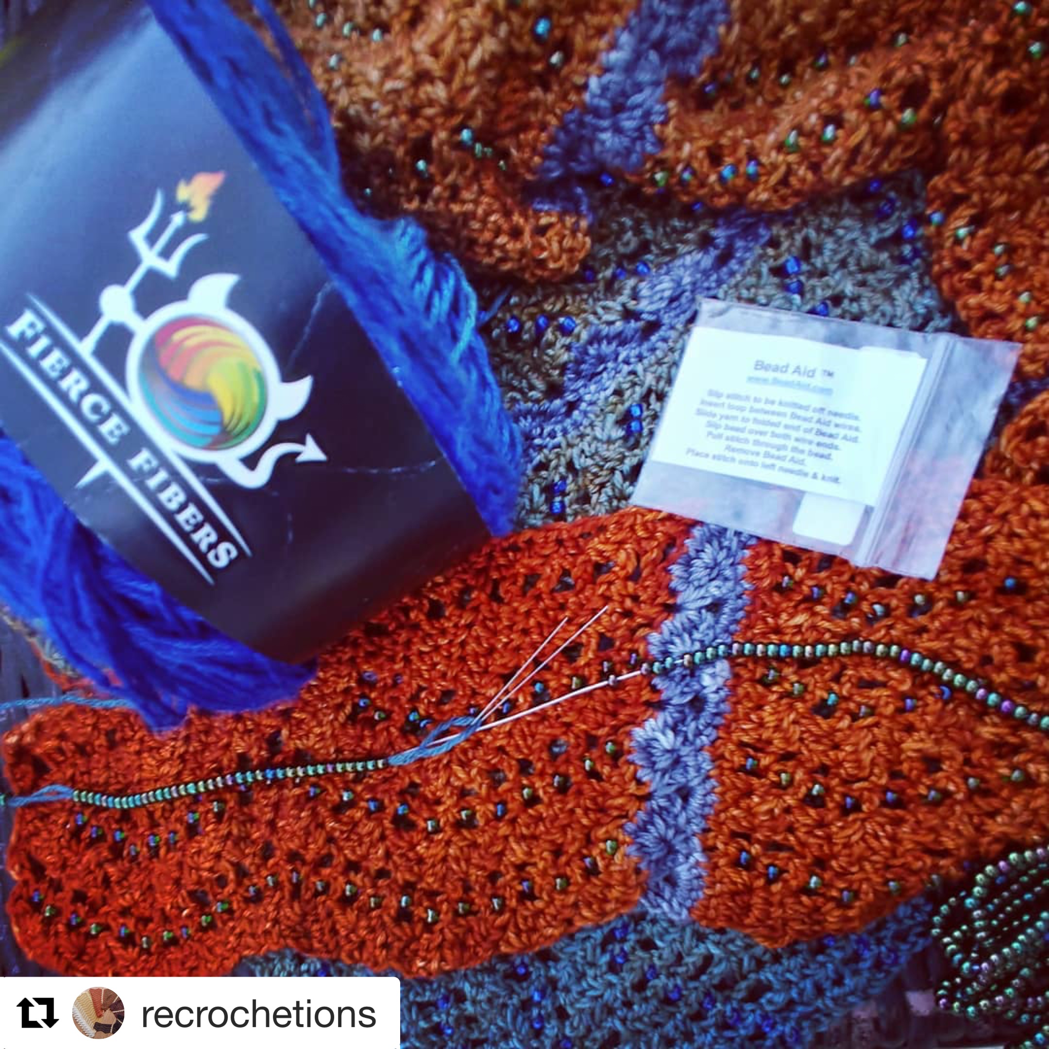
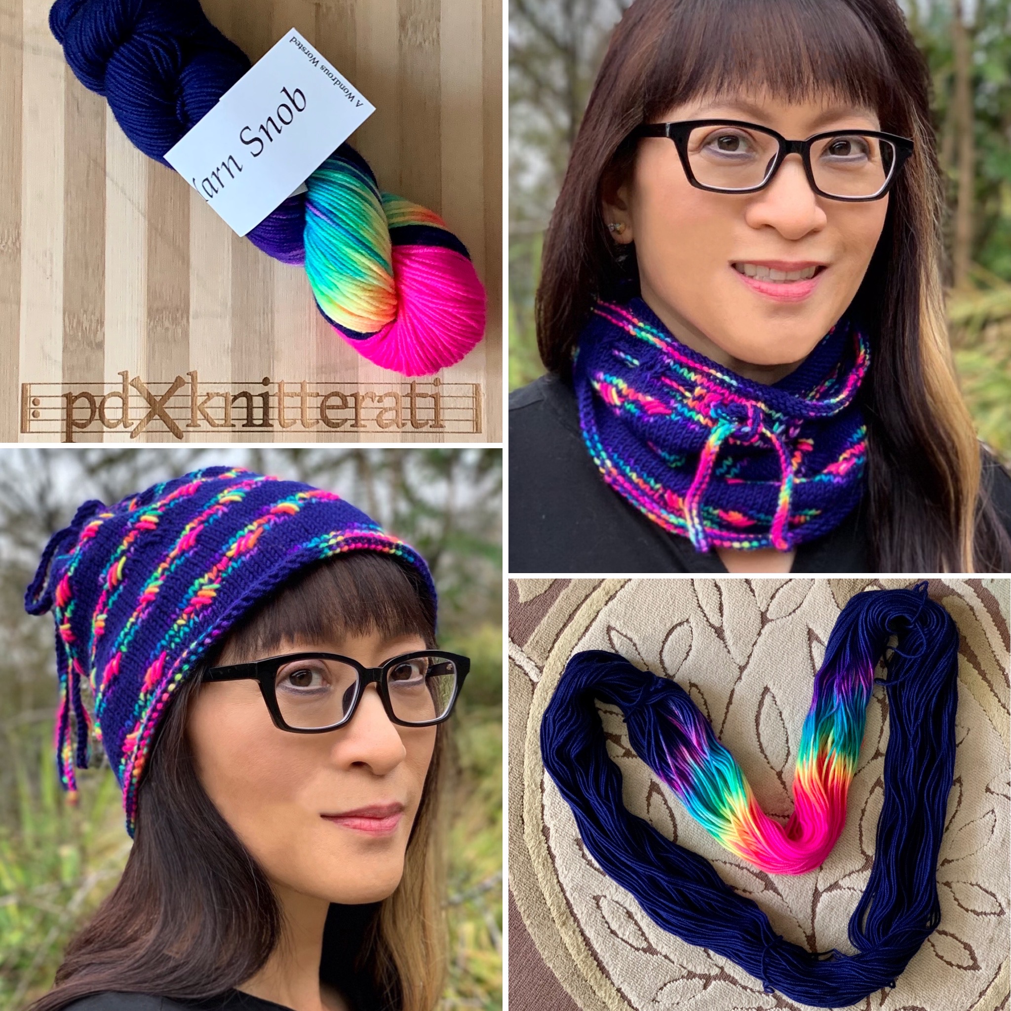
Edited to add this picture of Laurinda’s take on color and beads.
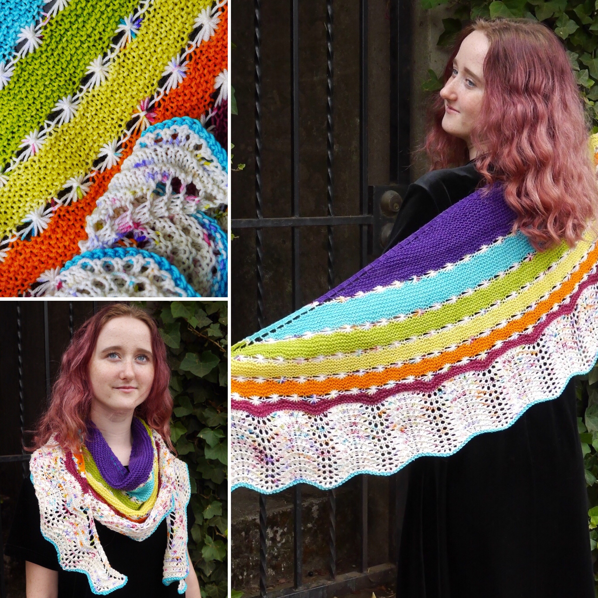
I’m looking forward to this weekend’s Nymphaea Shawl Retreat with Laurinda Reddig. We’ll be talking about color choice as we begin knitting or crocheting our Nymphaea shawls. And my Nymphaea pattern will be available through Ravelry next week when I get back; I’ll have a re-launch now that it’s mine again.
Color choices are so interesting, and so personal. I loved knitting my rainbow Lucky Stars shawl, but it’s more color than I normally wear.
I’m wearing my Carbon/Pollen Lucky Stars all the time: One neutral main color (gray gradient) and the golden pop.
My clothes are mostly black. It’s a great background to show off my knitting! Occasionally my skirt will tie in with the theme.
But that’s usually as far from black as I get.
How do YOU feel about color?


I usually prefer to use a contrasting bead – what’s the point of doing all that work and you can’t see it?
That last bead choice is just perfect.
I may not be able to articulate what color choices I like before hand, but I definitely know what I like and what I don’t once I sit down with the actual yarn/beads/floss.
I waffle between contrasty and blendy. In general, I do like some contrast in my colours, but looking back on the beaded projects I’ve done, when it comes to beads, I seem to gravitate more toward the blendy end of the spectrum. Too much contrast and it can look almost polka-dot-like, which isn’t necessarily what one is going for. Closer colour matches are certainly more subtle, but I do like the little sparkle they add — almost like drops of water.
Looking back on my projects, Iâm pretty blendy, too. I like a little sparkle for enhancement, but too much contrast made me feel like I had bugs on me. No way!